I have the privilege of a weekly conversation with the eminent elder statesman of International Style graphic design, Zürich-based Fritz Gottschalk. He delights in posing provocative questions. Notes from this week’s encounter.
Fritz observes that automotive brands seem to be dropping animated, 3-dimensional or colorful brand signatures. Says it is a trend. He’s seen it in VW, Audi and Toyota branding.
Here’s the evolution of the VW visual brand.

and the current iteration which follows:
A successful exercise in simplification; it involves the removal of color, 3d rendering and drop shadow. These were embellishments added after the advent of desktop publishing. The new version strips away the superficial vagueness and misleading flourishes of marketing.

The new VW recollects the diagram of an electrical wall plug. It preserves angles of original letterforms. It improves the signature’s optics by lightening the character stroke, places letterforms higher in circular motif, adding white space at bottom. It makes the logo more versatile - improves legibility in reduction. The circular motif bespeaks natural order and economy - allows equal measure on all sides.
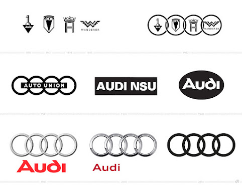
A similar evolution in the competitor brands, whose logos are more complex, not as iconic, less legible. First, Toyota, removing typography and lightening signet stroke.

and the current iteration of the Audi signet