Monday, September 27, 2021

Travel and Hospitality Trends

 Here's an article I recently authored for Toronto-based Branders magazine.


Where are we headed now?


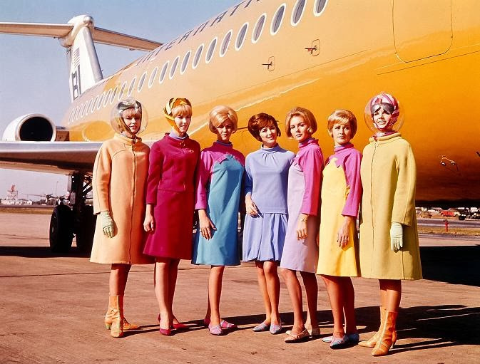
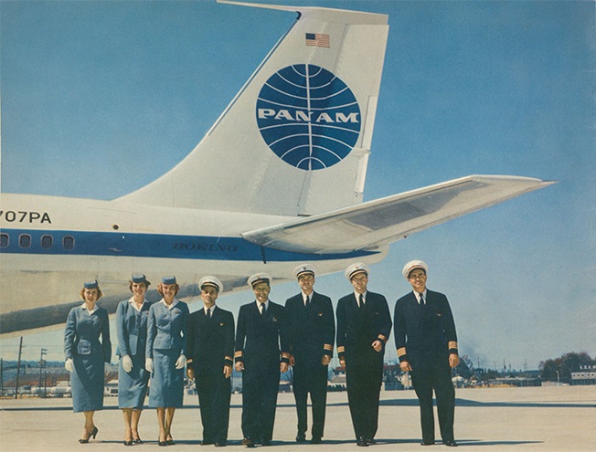
Let me first tell you a tale of a vanished world, a more innocent time when people wandered freely and visited new places at the last minute; effortlessly crossed borders without interruption; witnessed romantic panoramas (accessorized with hot tubs, palm trees, hammocks and always-full champagne flutes) in the most exotic of island destinations; took many a selfie on enviable backdrops; stayed in luxurious hotel suites; sought out the best deals on the internet and came home Monday mornings energized after spontaneous getaway weekends.

But then a plague swept across the land and changed everything. Suddenly you couldn’t travel for pleasure or for work. The airline business went belly-up. Car rentals, forget about it. Your favorite small and mid-sized hotels shuttered. You had to stay home, or wear a mask when you went out. Cool destinations became inaccessible. Big chain hotels downsized their brands. Thousands of service jobs evaporated. Only private jet travel boomed.

What can be told about the brand world of the future, now that mass tourism as we knew it is a figment of the past?


1. Brands will need to attract new talent, train new people, and emphasize workplace improvements to retain team members. With the loss of so many jobs and people reluctant to rejoin the workforce, it’s going to be arduous to get replacement staff into service positions. Prepare for tough times ahead in HR Departments.


2. The age of bargains is over. As brands struggle to recoup lost revenues, travel is going to be more expensive than it was before, with fewer irresistible deals. The getaway weekend special is on temporary hold until the industry stabilizes.


3. A younger demographic will venture forth, eager to get out after being sequestered so long, prepared to spend discretionary income on better adventures. But these adventures will need to track with their hopes and ideals. Youthful travelers will seek values-driven experiences that may involve cultural immersion, community engagement, good deeds built into relaxing holidays. Gen Z prefers glamping to cruise ships.


4. The luxury sector will be the first to rebound. The one percent is ready for a return to action. Among its seven ultra-exclusive hospitality offerings, the French Airelles chain recently opened a 14-suite property on the grounds of the Château de Versailles, where rates start at just above US$2000 per night for the entry level room.


5. Brands will need to promote their sustainability credentials. Green Pearls, a German chain with international presence, chooses its member properties based on sustainable initiatives and green projects. Their brand marketing focuses on owner profiles, ethical policies, local engagement, hotels and holiday homes in historic buildings, smaller scale, and zero food miles in F&B offerings.


6. Look for synergies generated around collaboration and cobranding. Already Airbnb has brand partnerships with Ikea and Lego. The small airline Eva Air has a branded jet emblazoned with Hello Kitty.


7. Big chains will grow meeting and conventions business. Volume is the name of the game. Heritage Hotels of Lisbon has spent the pandemic upgrading existing properties and preparing for the return of larger scale parties. Their brand emphasizes authentic Portuguese style and comfort.


8. Staycation is the new green. Travelers will opt for longer single location stays. Family-friendly resorts and residences will focus on long-duration guests with full-service offering. The Baglioni Group, an Italian luxury brand, shuttered four Italy multi-room big city properties and in June opened The Baglioni Resort Sardinia, located on Sardinia's north-east coast. They have a second resort newly-opened in the Maldives.


9. Ask the team. During the pandemic Hoshino Resorts, a remarkable Tokyo-based hotel group who have many hot water spa properties on the Japanese archipelago, retained all their staff, albeit with reduced hours. They asked their team for suggestions on pandemic workarounds, how to better accommodate guests, ways to make their service more responsive and efficient. One great innovation was a custom app which advised guests of wait times and guest numbers at spas. Another staff-generated brand strategy in response to reduced travel itineraries was to attract guests who lived closer to the resorts.


10. Market locally. Along the lines of the Hoshinoya strategy, Accor, a monolithic French hospitality chain, oriented its Pullman sub-brand to attract neighborhood clients by emphasizing culture, and offered public areas at their hotels as a welcoming meeting place for local traffic.

Sunday, July 11, 2021

Conversations with Gottschalk, Part 3: airlines

Fritz Gottschalk, the grand old man of Swiss Design, is founder of Zürich-based Gottschalk+Ash, international design consultants. (Spoiler alert: I’ve served as international brand guru for the firm since 2003.) Fritz designed what is inarguably the foremost example of nation-branding on planet earth, the legendary Swiss passport, executed in 1985.


This is the last of 3 conversations with Fritz, straight talk about the shape of strategic branding today. Our first conversation dealt with the latest evolution of automotive logos; our second conversation looked at the French petro giant Total’s latest logo evolution. For our third conversation, Fritz looked at a number of airline brands. With the reopening of the travel market and the entry into market of a number of newcomers it seemed like a good topic to engage. 


Fritz is of the emphatic opinion that airline brands began from a point of reverence for perfect design reflecting engineering, but have since devolved to examples of simple garish embellishment. Aircraft, he said, were always beautiful because they were innately functional. At the outset, the public viewed air travel with awe and respect. The cost of an air ticket was in synch with the respect of and joy for flying. Now that air travel has become the mode of transport for the masses, the quality of the art has “hit rock bottom.” More than once he used the word garish to describe the state of current design.


I began by asking Fritz what he felt the greatest airline brand ever made was. Of course, he chose the masterful solution for Swissair created by Karl Gerstner. A look at the level of craftsmanship which endures shows the excellence of the brand work. A careful examination reveals that Gerstner preserved the proportional nuance of 7:6 in the Swiss cross - a perfect square only exists at the center point of intersection. A detail like that is what makes for great design.


It was the correct moment to engage the classics.


Fritz called Vignelli’s famous 1968 identity for American Airlines “concise, intelligent, underpowered and drab.” He cited the unpainted aircraft as a downside of the branding, but he was complimentary about the double-A+eagle symbol.


We spoke about the legendary 1965 solution for Braniff, a lesser airline which was put on the map by the advertising agency Wells Rich Greene. Fritz characterized it as “pure marketing” and felt it heralded a new generation of design. I felt it was a prescient solution, since today all luxury brands have collaborations with artists like Calder and fashion houses like Pucci. So Braniff re-thought a staid idea to good effect. The idea endures.


Fritz had praise for the Eastern Airlines brand over the years. He called the legacy solution elegant, timeless, to the point, and sophisticated. A recent rebranding in 2020 referenced the Braniff solution, and simplified the logotype, while retaining the heritage symbol, seen on the aircraft tail.


Fritz also had kind words for the abiding purity of the KLM and Lufthansa brands.


I interjected that I always liked the vintage SAS brand

I appreciate the use of italics to suggest motion and movement, the sparse letterforms reminiscent of Optima, the simplicity and economy of Scandinavian design.


I asked Fritz to reflect on the classic Pan Am brand.

He characterized it as wonderful, reminiscent of the great times in which it was created. He reminded me that great brands are always close to the beat of their times.


It’s true. The classic vintage Pan Am shoulder bag still stands as an emblematic accessory for all travelers.


Vueling is one of the last brands executed under the supervision of the late Wally Olins. A Barcelona-based budget airline, their graphics are distinguished by a minimalist treatment and a playful attitude. The website is quite efficient, the rates are low, and the service reliable. 


Unfortunately, American’s recent rebranding is a weak substitute for the intelligence and clear-headed iconography of Vignelli’s earlier work.


Next we touched on the ultimate budget airline, the much reviled Easyjet. Fritz said that there was no thinking evident in this solution. The absence of any typographic sophistication, the blatant marketing, and the aircraft as a flying billboard contribute to prevalent visual pollution. Fritz also observed that this disturbing branding degrades the beautiful shapes of aircraft, which are in themselves elegant sculptural objects.


It seems like Southwest’s designers revisited Braniff’s ideas to apply primary color and supergraphic treatments to their aircraft. They are nowhere near as exciting as those generated a half century ago.


Now to the flood of garish newcomers to the marketplace.


Volotea, a budget airline that covers the eastern Mediterranean, has partnered with Aegean to add destinations in Greece. The brand identities are decorative and can barely be distinguished from each other- so the partnership dilutes each, and reduces differentiation.


Air Dolomiti has an undistinguished signature reminiscent of other brands, not all of them in the airline business. The decorated tail of their aircraft looks like the logo has been dumped over a confusing motif and obscures any brand identification. Coupled with a confusing typographic solution, the brand does not inspire confidence.


The same malaise afflicts Avelo. An uninteresting typographic solution coupled with a confused cosmetic motif gives the brand little distinction.


Looks like a private jet, doesn’t it? But Breeze adds a double marketing flourish to its signature, a check mark and an embedded pun. We are supposed to think it is easy to travel with these folks. If it’s so simple, what does the check mark represent?


French Bee is a new transatlantic budget airline, €220 from Paris/Orly to NYC. I am not sure I see a bee, but I do see a butterfly. Or perhaps a shamrock? Misleading advertising implies the low number is a round-trip, which it is not. 


The extremely popular low-budget carrier jetBlue borrows a typographic figure from the iMac universe, but it’s a shabby treatment plastered on a confused background which appears on the aircraft tail. The graphical solution correctly suggests a no-frills experience.


Small Planet looks like they have harvested their logotype from Google. And then pasted a fruit salad over the tail of the aircraft. One has the impression the multicolor and childlike type treatment is supposed to suggest diversity and play. It may also suggest, “Don’t take us too seriously.”


Budapest-based Wizz Air suggests they will turn things upside down in a surprising way. Yet they seem to have borrowed their color palette from Air New Zealand or any of the South Asian carriers. Their typographic twist uses the inverted i character to suggest the Spanish exclamation point. In case you missed it, their website is shown on both the aircraft side and on the jet engine. 


Finally, Fritz cites Qantas for once-noteworthy brand work. But their latest redrawing has simplified the kangaroo icon, so that the poor creature has lost its arms. A more legible type treatment has been adopted. The addition of computer-rendered gradation on the aircraft tail motif has devalued the brand representation.


Saturday, July 3, 2021

Conversations with Gottschalk, Part 2: an oil giant logo

Fritz looks at the French oil giant Total, saying that their latest signature iteration is a weak evolution. Recently there’s been a change of nomenclature, adding the word ‘Energies’ to the wordmark. This addition tends to clutter the legibility, and draws attention away from the legacy name. The confusing polychromatic treatment de-emphasizes the legacy color blue. It’s unclear what the monogram represents, if anything, though I’m certain the designer has some clever text to describe it.

.


The best solution seems to have been the 1955-1963 treatment which reinforces the legacy colors and represents a gas flame. Today’s signature is more complex, and grouping a monogram with a full wordmark communicates redundancy. The friendly, curvaceous letterforms remove a level of formality, as if the brand takes a cavalier attitude about energy, ignoring the seriousness of issues of complicity in carbon emissions. 


Friday, June 18, 2021

Conversations with Gottschalk, Part 1: Automotive logos

 I have the privilege of a weekly conversation with the eminent elder statesman of International Style graphic design, Zürich-based Fritz Gottschalk. He delights in posing provocative questions. Notes from this week’s encounter. 


Fritz observes that automotive brands seem to be dropping animated, 3-dimensional or colorful brand signatures. Says it is a trend. He’s seen it in VW, Audi and Toyota branding.

Here’s the evolution of the VW visual brand.


and the current iteration which follows:

A successful exercise in simplification; it involves the removal of color, 3d rendering and drop shadow. These were embellishments added after the advent of desktop publishing. The new version strips away the superficial vagueness and misleading flourishes of marketing.


The new VW recollects the diagram of an electrical wall plug. It preserves angles of original letterforms. It improves the signature’s optics by lightening the character stroke, places letterforms higher in circular motif, adding white space at bottom. It makes the logo more versatile - improves legibility in reduction. The circular motif bespeaks natural order and economy - allows equal measure on all sides.


A similar evolution in the competitor brands, whose logos are more complex, not as iconic, less legible. First, Toyota, removing typography and lightening signet stroke.


and the current iteration of the Audi signet

Next installment: A venerable French petroleum brand catches Fritz's attention.

Tuesday, March 23, 2021

Six years ago we saw this coming

Branding and Marketing. Saw this coming six years ago. Excerpted from DiGanZi's 2016 Global Brand Letter:


The NRA has called the AR-15 “America’s rifle.” A favorite of returning vets, the model known by the US armed forces as the M16 was introduced in 1959 by ArmaLite. It’s the gun of choice in mass shootings. With an average retail price just above $1000, aficionados typically keep 3 versions of the assault rifle at home. Banned under federal law from 1994-2004, several million of the guns still slumber in the nation’s rifle racks and gun safes, used for hunting, sport, and self-defense. The AR-15 is fun, customizable, affordable and you can build your own, the Lego set of the gun world. But the traditional white male user group is aging and dying off, so now the industry turns its aim on the next generation of younger gun enthusiasts: a modern sporting rifle, easy-to-use, with a soft recoil, and fires a gratifying eight rounds a second. Despite the popularity of games like “Call of Duty”, association with military glamour is downplayed. An article in an industry trade mag cautioned salespeople about certain first-time buyers who will eventually discover they have a lot to learn.
In Russia, consumers can buy a long-barreled firearm only with a police permit, have no criminal record, must furnish a diploma from a gun safety course and a medical certificate that clears them of any mental illness. Civilians are not allowed to own pistols. More than 100 million AK-47s have been sold worldwide, not to mention countless knockoffs, meaning a largely saturated military market. In response, Kalashnikov rebrands, a shift from serving conflict to serving consumers. A new stylized K logo and the catchy tagline “Kalashnikov: Real. Reliable.” positions the brand for sale to hobbyists and hunters. Domestic demand and energy prices help AKs better compete against imported firearms. Due to sanctions, shipments destined for the lucrative US market have been stopped at customs, rerouted to insignificant markets like Venezuela. A diversification into new product lines is under way with Kalashnikov buying up companies that make motorboats and surveillance drones. An eponymous clothing line with 60 retail stores in Russia launched. Weapon buyers are seduced by the bespoke range of special options available, different materials for rifle exterior, colors and finishes. Marx would be turning over in his grave if he knew that the company operates under the blatantly anti-egalitarian principle that no two comrades have the same taste.

Sunday, March 14, 2021

A short dissertation on vaccine packaging

Packaging for Covid-19 vaccines delivers a wealth of cultural and strategic signals which the graphic designer immediately notes. Ask a recently vaccinated person the brand they received, and you discover they all know the name, while they can't tell you much of the difference from the competitors. Can any distinction or messaging be discerned in the boxing and labeling? 


Astrazeneca doesn't use its twisty and confusing logo, and instead brands the package using a pure type treatment for its company name, which unusually follows the vaccine identifier. The box likes white space, so there's little material available for differentiation or brand identity. The design relies on a confusing system of multicolored vertical bars and a right-facing triangle which focuses attention on the virus name, which is rendered in the largest sized font on the box, in case you missed the fact that this is a Covid product. Despite the effort to embellish the package with design elements, it still looks like something you'd get at the doctor or the pharmacy. In case you missed the fact, it tells you the box contains a vaccine.


Moderna, one of the frontrunners, has greyed out its corporate signature at the upper left. It then renders its company name, a redundant element, in the same type size and red color as the all caps virus name, and calls out the fact that it contains a vaccine within. A thick process blue outline frames the box. The package has a decidedly retro look, more like a 1940s bromide package than some 21st century miracle cure. The decision to employ an inept contemporary recutting of Futura (or perhaps a bastard version of Avant Garde) for the package signature reveals a lazy attitude which is reflected as well in line and letter spacing.


Pfizer chooses to brand its packaging by using only its oval blue logo, designed in 1987 by Gene Grossman. The brand signature is a tiny blue planet placed on the label of a Costco-sized multi-pack of 195 doses, or prominently on the bottle. Each individual bottle carries the logo large, surrounded by the words "Coronavirus Vaccine." There's a kind of unquestioned and confident brand ethos at play here, as if to imply no other choices exist in the marketplace. If you want to be immune, the packaging advises, go with the big gorilla.


The one-jab Johnson & Johnson vaccine is actually a product of Janssen Biotech, a division of the drug monolith. J&J's logo color is red, but doesn't appear on the vaccine packaging. Here we are back chromatically in pharma blue-land, with a bland typographic version of Akzidenz (perhaps) for the product signature. Janssen's logo isn't present. This could easily be packaging for a veterinary drug, opioids, or something you chew for indigestion. There's no attempt at differentiation. The boxing could be confused with competitor Pfizer's product. Pray that your doctor doesn't grab for the wrong box when it's injection time.


 Sinovac, the Chinese-developed product seems to have a problem with conflicting vision. Its light mandarin top contrasts with the orange juice color of the identifier panel, implying a kind of indecision. There's a strange grey left-facing vector pushing the eye away from the product name. They remind you this is a vaccine which also covers SARS, which nobody goes to a Covid site for. The type seems bunched up against the vector as if a boiler plate packaging solution was hurriedly redeployed for the most important vaccine of the era, perhaps your life. This box could easily be one of those organic toothpastes you get for inflated prices at the health food store. 


Sputnik V, the Russian vaccine, is an exercise in total marketing. The package is a monument to commerce, with its colorful credit at upper left to the "Russian Direct Investment Fund." At upper right "The Gamaleva National Center" gives a prop to the lab which developed the vaccine. In case you missed the point there's a strange "p" character in the product signature. It could be a hybrid Russian letterform lending cultural identity to the product; it could be a glyph which represents - I don't know what- maybe turned on its side it means something. Below the signature the package reminds you it's "THE FIRST REGISTERED COVID-19 VACCINE." If that wasn't enough, the tiny line at the bottom reads "PROVEN HUMAN ADENOVIRAL TECHNOLOGY." Twist my arm, comrade. In Hungary, Russia has made the vaccine available as a premium luxury product. It's packaged in a luscious military green fabric pouch with white piping, fastened with a decorative red ribbon.