
Packaging for Covid-19 vaccines delivers a wealth of cultural and strategic signals which the graphic designer immediately notes. Ask a recently vaccinated person the brand they received, and you discover they all know the name, while they can't tell you much of the difference from the competitors. Can any distinction or messaging be discerned in the boxing and labeling?
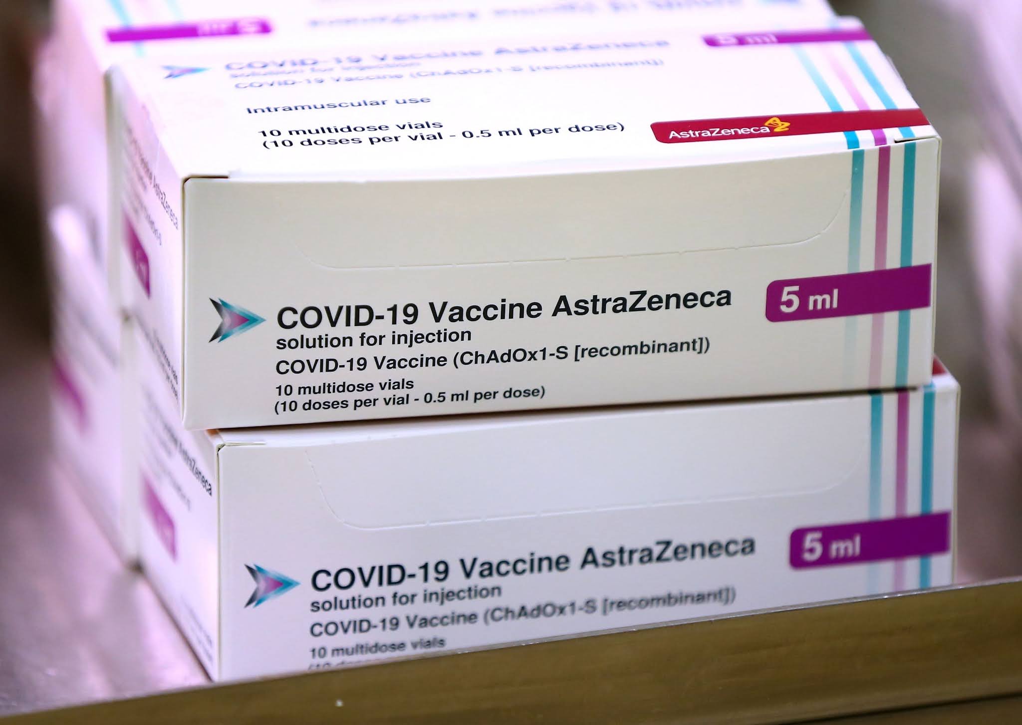
Astrazeneca doesn't use its twisty and confusing logo, and instead brands the package using a pure type treatment for its company name, which unusually follows the vaccine identifier. The box likes white space, so there's little material available for differentiation or brand identity. The design relies on a confusing system of multicolored vertical bars and a right-facing triangle which focuses attention on the virus name, which is rendered in the largest sized font on the box, in case you missed the fact that this is a Covid product. Despite the effort to embellish the package with design elements, it still looks like something you'd get at the doctor or the pharmacy. In case you missed the fact, it tells you the box contains a vaccine.

Moderna, one of the frontrunners, has greyed out its corporate signature at the upper left. It then renders its company name, a redundant element, in the same type size and red color as the all caps virus name, and calls out the fact that it contains a vaccine within. A thick process blue outline frames the box. The package has a decidedly retro look, more like a 1940s bromide package than some 21st century miracle cure. The decision to employ an inept contemporary recutting of Futura (or perhaps a bastard version of Avant Garde) for the package signature reveals a lazy attitude which is reflected as well in line and letter spacing.

Pfizer chooses to brand its packaging by using only its oval blue logo, designed in 1987 by Gene Grossman. The brand signature is a tiny blue planet placed on the label of a Costco-sized multi-pack of 195 doses, or prominently on the bottle. Each individual bottle carries the logo large, surrounded by the words "Coronavirus Vaccine." There's a kind of unquestioned and confident brand ethos at play here, as if to imply no other choices exist in the marketplace. If you want to be immune, the packaging advises, go with the big gorilla.

The one-jab Johnson & Johnson vaccine is actually a product of Janssen Biotech, a division of the drug monolith. J&J's logo color is red, but doesn't appear on the vaccine packaging. Here we are back chromatically in pharma blue-land, with a bland typographic version of Akzidenz (perhaps) for the product signature. Janssen's logo isn't present. This could easily be packaging for a veterinary drug, opioids, or something you chew for indigestion. There's no attempt at differentiation. The boxing could be confused with competitor Pfizer's product. Pray that your doctor doesn't grab for the wrong box when it's injection time.

Sinovac, the Chinese-developed product seems to have a problem with conflicting vision. Its light mandarin top contrasts with the orange juice color of the identifier panel, implying a kind of indecision. There's a strange grey left-facing vector pushing the eye away from the product name. They remind you this is a vaccine which also covers SARS, which nobody goes to a Covid site for. The type seems bunched up against the vector as if a boiler plate packaging solution was hurriedly redeployed for the most important vaccine of the era, perhaps your life. This box could easily be one of those organic toothpastes you get for inflated prices at the health food store.

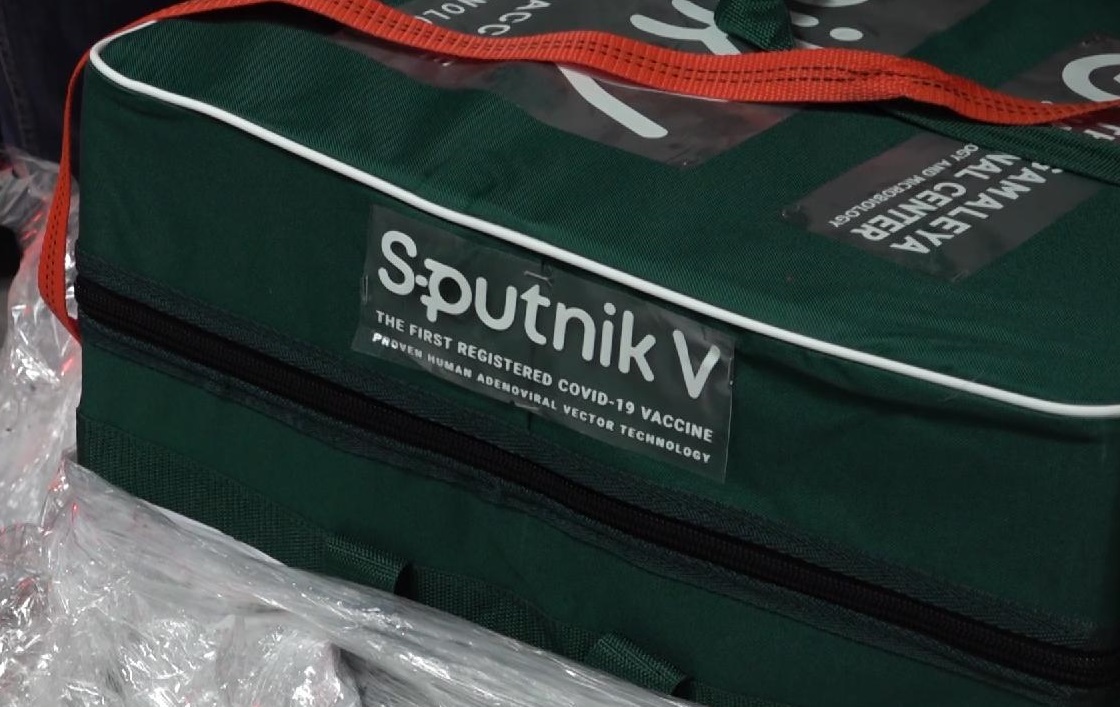
Sputnik V, the Russian vaccine, is an exercise in total marketing. The package is a monument to commerce, with its colorful credit at upper left to the "Russian Direct Investment Fund." At upper right "The Gamaleva National Center" gives a prop to the lab which developed the vaccine. In case you missed the point there's a strange "p" character in the product signature. It could be a hybrid Russian letterform lending cultural identity to the product; it could be a glyph which represents - I don't know what- maybe turned on its side it means something. Below the signature the package reminds you it's "THE FIRST REGISTERED COVID-19 VACCINE." If that wasn't enough, the tiny line at the bottom reads "PROVEN HUMAN ADENOVIRAL TECHNOLOGY." Twist my arm, comrade. In Hungary, Russia has made the vaccine available as a premium luxury product. It's packaged in a luscious military green fabric pouch with white piping, fastened with a decorative red ribbon.
No comments:
Post a Comment
Thanks for your thoughts.