
Fritz Gottschalk, the grand old man of Swiss Design, is founder of Zürich-based Gottschalk+Ash, international design consultants. (Spoiler alert: I’ve served as international brand guru for the firm since 2003.) Fritz designed what is inarguably the foremost example of nation-branding on planet earth, the legendary Swiss passport, executed in 1985.
This is the last of 3 conversations with Fritz, straight talk about the shape of strategic branding today. Our first conversation dealt with the latest evolution of automotive logos; our second conversation looked at the French petro giant Total’s latest logo evolution. For our third conversation, Fritz looked at a number of airline brands. With the reopening of the travel market and the entry into market of a number of newcomers it seemed like a good topic to engage.
Fritz is of the emphatic opinion that airline brands began from a point of reverence for perfect design reflecting engineering, but have since devolved to examples of simple garish embellishment. Aircraft, he said, were always beautiful because they were innately functional. At the outset, the public viewed air travel with awe and respect. The cost of an air ticket was in synch with the respect of and joy for flying. Now that air travel has become the mode of transport for the masses, the quality of the art has “hit rock bottom.” More than once he used the word garish to describe the state of current design.
I began by asking Fritz what he felt the greatest airline brand ever made was. Of course, he chose the masterful solution for Swissair created by Karl Gerstner. A look at the level of craftsmanship which endures shows the excellence of the brand work. A careful examination reveals that Gerstner preserved the proportional nuance of 7:6 in the Swiss cross - a perfect square only exists at the center point of intersection. A detail like that is what makes for great design.

It was the correct moment to engage the classics.
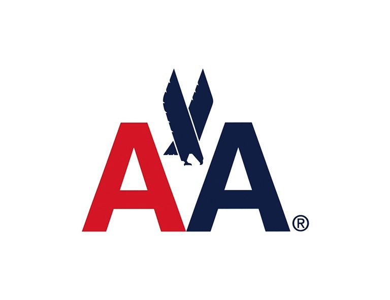
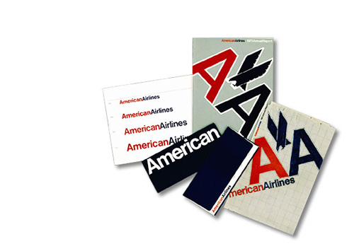
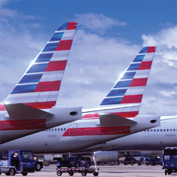
Fritz called Vignelli’s famous 1968 identity for American Airlines “concise, intelligent, underpowered and drab.” He cited the unpainted aircraft as a downside of the branding, but he was complimentary about the double-A+eagle symbol.
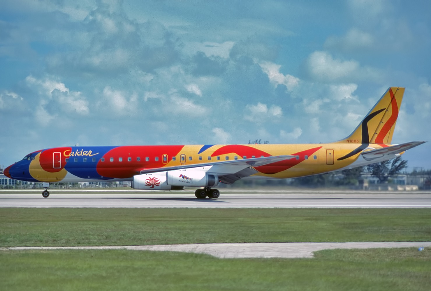
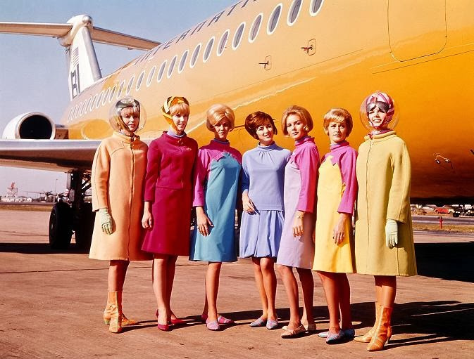
We spoke about the legendary 1965 solution for Braniff, a lesser airline which was put on the map by the advertising agency Wells Rich Greene. Fritz characterized it as “pure marketing” and felt it heralded a new generation of design. I felt it was a prescient solution, since today all luxury brands have collaborations with artists like Calder and fashion houses like Pucci. So Braniff re-thought a staid idea to good effect. The idea endures.
Fritz had praise for the Eastern Airlines brand over the years. He called the legacy solution elegant, timeless, to the point, and sophisticated. A recent rebranding in 2020 referenced the Braniff solution, and simplified the logotype, while retaining the heritage symbol, seen on the aircraft tail.


Fritz also had kind words for the abiding purity of the KLM and Lufthansa brands.

I interjected that I always liked the vintage SAS brand
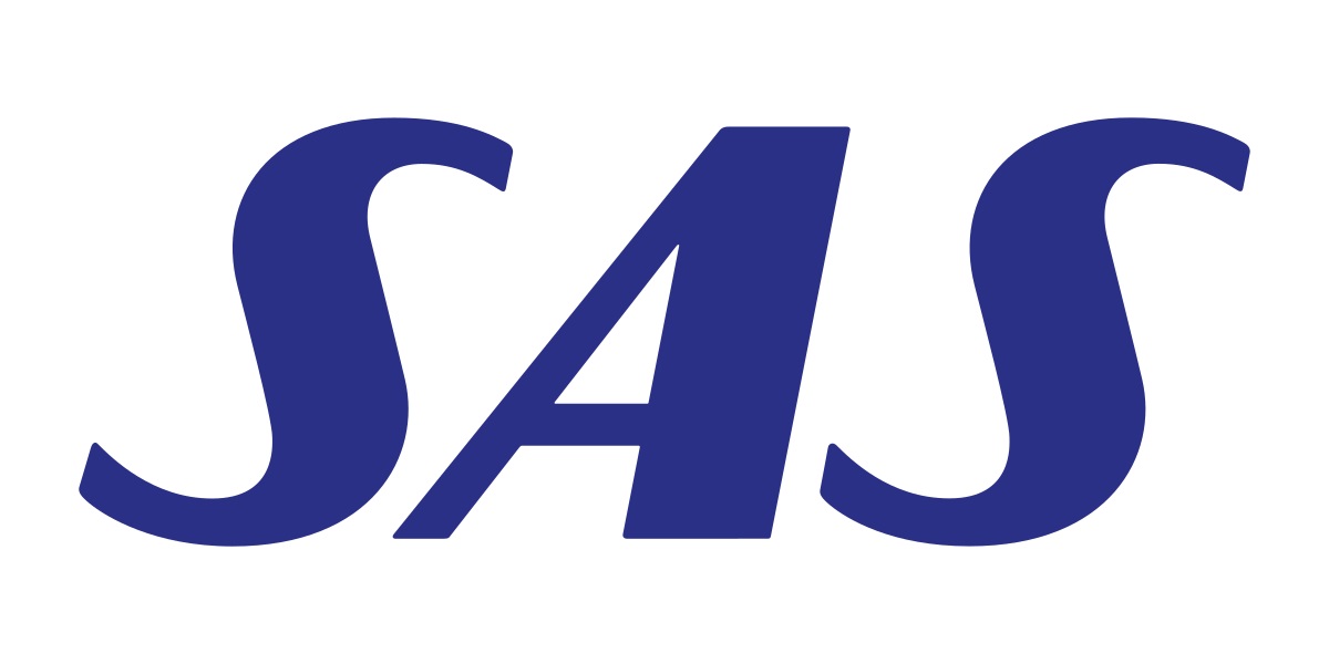
I appreciate the use of italics to suggest motion and movement, the sparse letterforms reminiscent of Optima, the simplicity and economy of Scandinavian design.
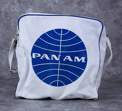
I asked Fritz to reflect on the classic Pan Am brand.
He characterized it as wonderful, reminiscent of the great times in which it was created. He reminded me that great brands are always close to the beat of their times.

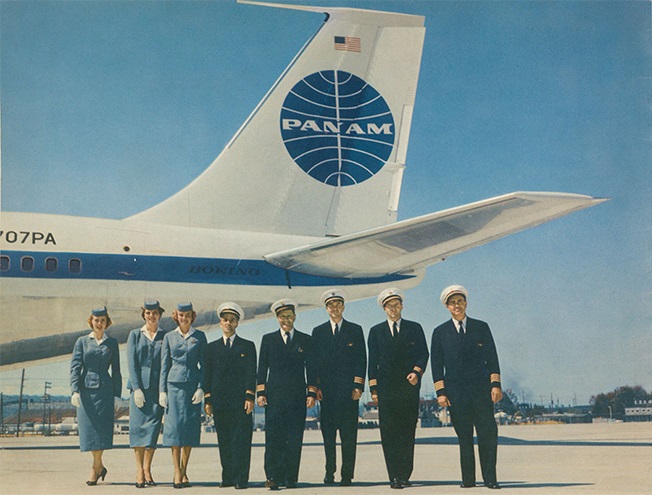
It’s true. The classic vintage Pan Am shoulder bag still stands as an emblematic accessory for all travelers.

Vueling is one of the last brands executed under the supervision of the late Wally Olins. A Barcelona-based budget airline, their graphics are distinguished by a minimalist treatment and a playful attitude. The website is quite efficient, the rates are low, and the service reliable.

Unfortunately, American’s recent rebranding is a weak substitute for the intelligence and clear-headed iconography of Vignelli’s earlier work.
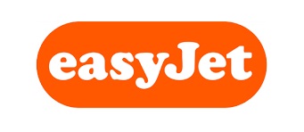
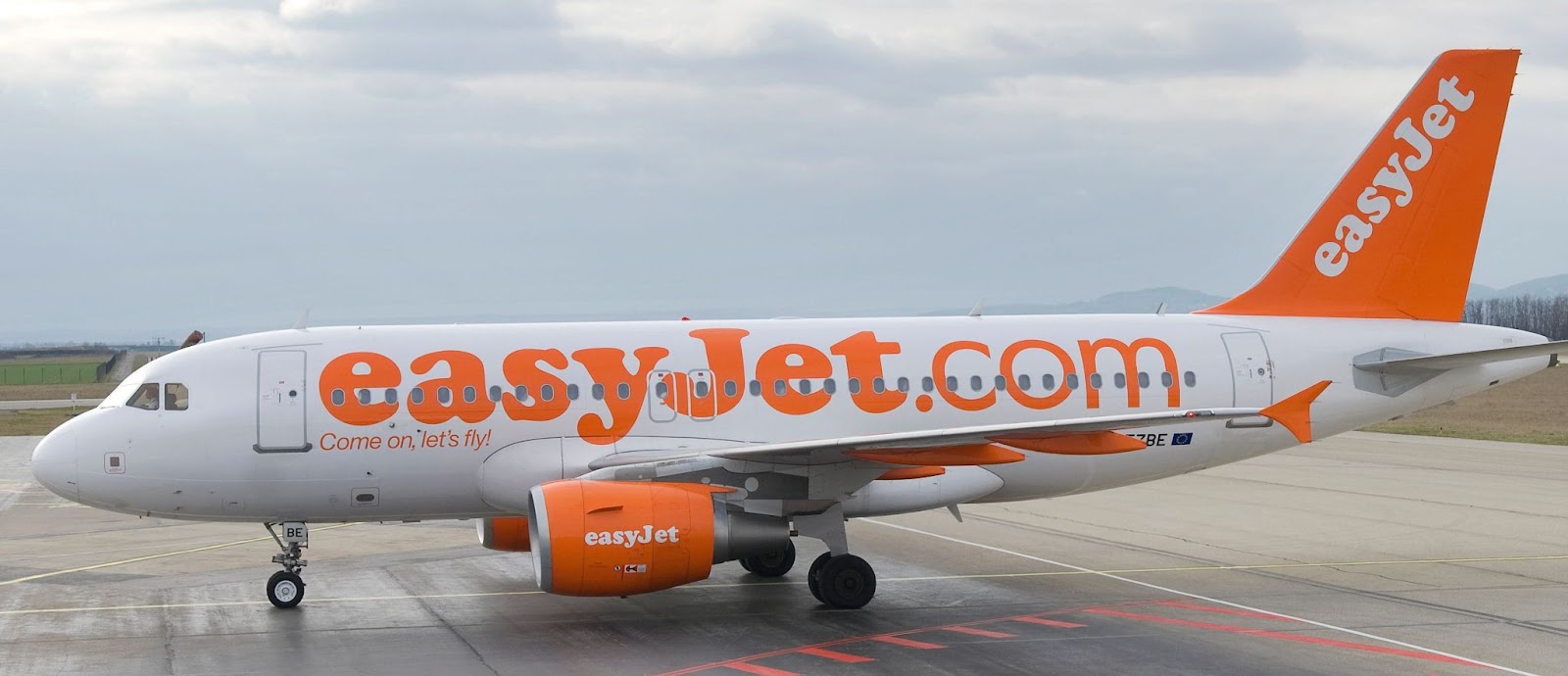
Next we touched on the ultimate budget airline, the much reviled Easyjet. Fritz said that there was no thinking evident in this solution. The absence of any typographic sophistication, the blatant marketing, and the aircraft as a flying billboard contribute to prevalent visual pollution. Fritz also observed that this disturbing branding degrades the beautiful shapes of aircraft, which are in themselves elegant sculptural objects.
It seems like Southwest’s designers revisited Braniff’s ideas to apply primary color and supergraphic treatments to their aircraft. They are nowhere near as exciting as those generated a half century ago.

Now to the flood of garish newcomers to the marketplace.
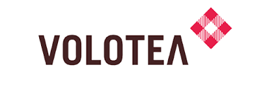
Volotea, a budget airline that covers the eastern Mediterranean, has partnered with Aegean to add destinations in Greece. The brand identities are decorative and can barely be distinguished from each other- so the partnership dilutes each, and reduces differentiation.

Air Dolomiti has an undistinguished signature reminiscent of other brands, not all of them in the airline business. The decorated tail of their aircraft looks like the logo has been dumped over a confusing motif and obscures any brand identification. Coupled with a confusing typographic solution, the brand does not inspire confidence.


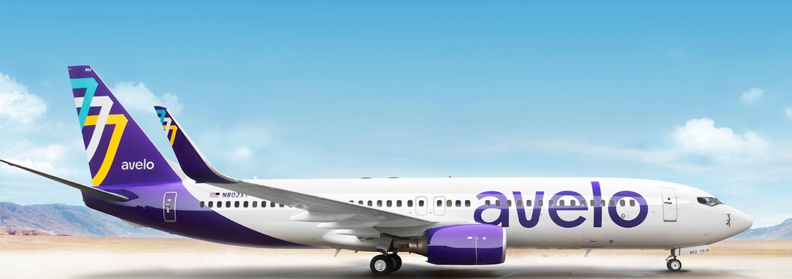
The same malaise afflicts Avelo. An uninteresting typographic solution coupled with a confused cosmetic motif gives the brand little distinction.
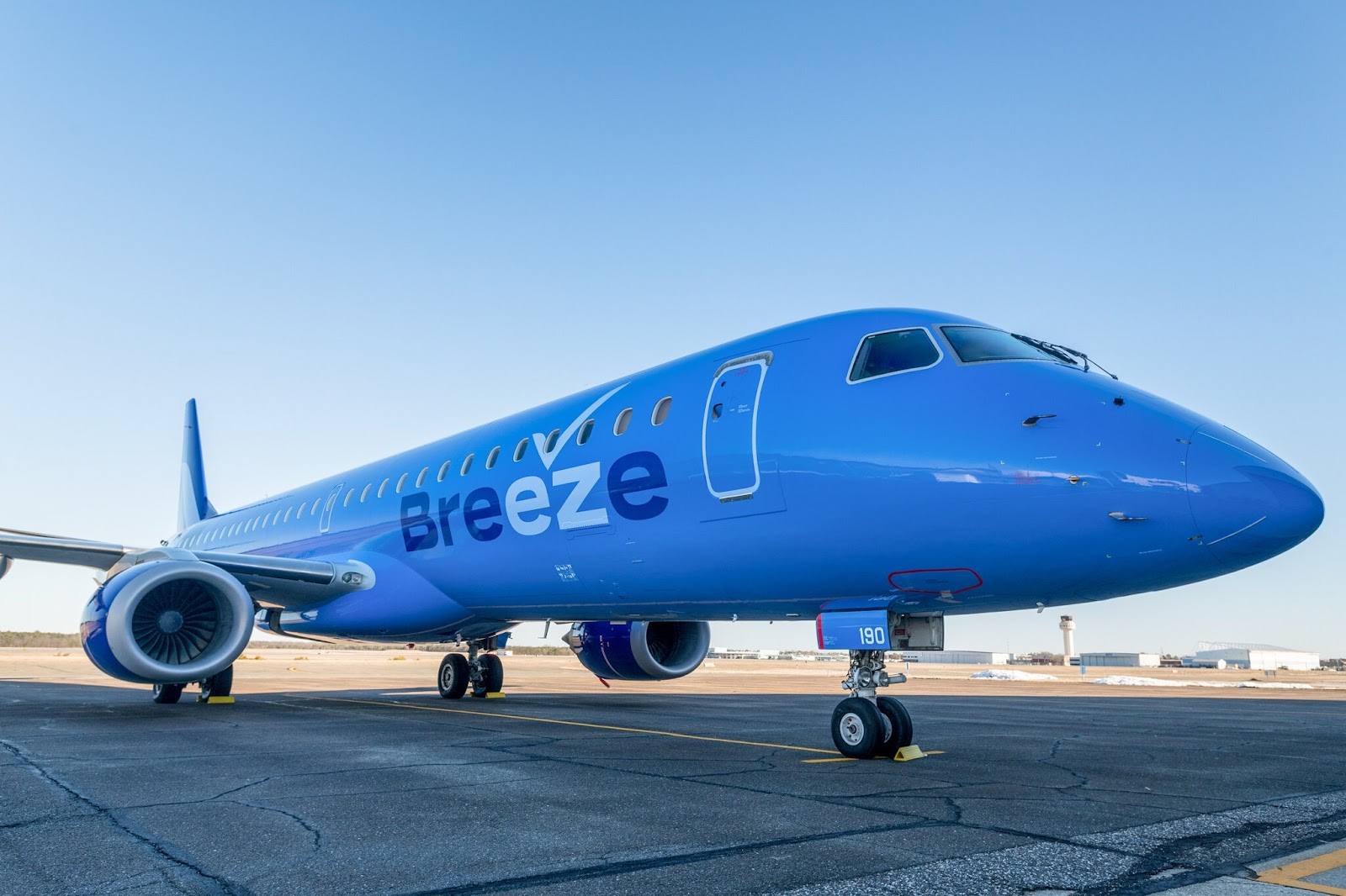
Looks like a private jet, doesn’t it? But Breeze adds a double marketing flourish to its signature, a check mark and an embedded pun. We are supposed to think it is easy to travel with these folks. If it’s so simple, what does the check mark represent?
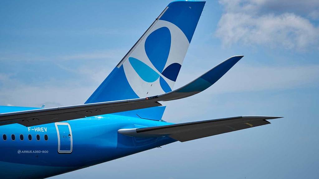
French Bee is a new transatlantic budget airline, €220 from Paris/Orly to NYC. I am not sure I see a bee, but I do see a butterfly. Or perhaps a shamrock? Misleading advertising implies the low number is a round-trip, which it is not.
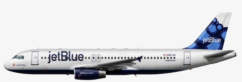
The extremely popular low-budget carrier jetBlue borrows a typographic figure from the iMac universe, but it’s a shabby treatment plastered on a confused background which appears on the aircraft tail. The graphical solution correctly suggests a no-frills experience.
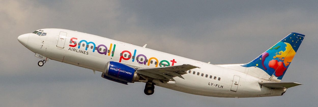
Small Planet looks like they have harvested their logotype from Google. And then pasted a fruit salad over the tail of the aircraft. One has the impression the multicolor and childlike type treatment is supposed to suggest diversity and play. It may also suggest, “Don’t take us too seriously.”
Budapest-based Wizz Air suggests they will turn things upside down in a surprising way. Yet they seem to have borrowed their color palette from Air New Zealand or any of the South Asian carriers. Their typographic twist uses the inverted i character to suggest the Spanish exclamation point. In case you missed it, their website is shown on both the aircraft side and on the jet engine.

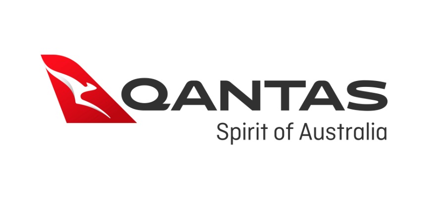
Finally, Fritz cites Qantas for once-noteworthy brand work. But their latest redrawing has simplified the kangaroo icon, so that the poor creature has lost its arms. A more legible type treatment has been adopted. The addition of computer-rendered gradation on the aircraft tail motif has devalued the brand representation.

No comments:
Post a Comment
Thanks for your thoughts.